- T. 031-955-4955
- 오전 10:00 ~ 오후 18:00
- 국민은행
- 657401-04-006683
- 이준경(지콜론)
SPECIAL FEATURE타이포그래피와 문화 / 먼 곳에서 온 편지 - Oded Ezer
먼 곳에서 온 편지
먼 곳에 편지를, 정확히 말하면 전자우편을 보냈다. 금방 답장이 왔다. 이처럼 세계는 한 마을로 가까워졌다. 그러나 사실 우리의 그 마을은 몇몇 국가로만 이루어져 있는지도 모른다. 늘 이야기되고 늘 보는 그런 나라들 말고, 우리의 심적인 거리로부터 ‘먼’ 곳의 이야기를 듣고자 히브리어권의 이스라엘과 아랍어권의 레바논으로 편지를 보냈다. 이스라엘의 타이포그래퍼 Oded Ezer와 Moshik Nadav, 레바논의 타이포그래퍼 Pascal Zoghbi, 그래피티 아티스트 ASHEKMAN으로부터 온 답장을 여기에 첨부한다. 에디터. 박선주. 번역. Ana Lee
1. Oded Ezer
Play,
don’t work.
분야 간 경계를 넘나들고 장벽을 허무는 작업을 즐기는 이스라엘의 그래픽디자이너, Oded Ezer. 그 작업의 재료는 타이포그래피고, 그 철학은 다음과 같다. “Play, don’t work”.
Oded Ezer
그래픽디자이너. 교육가이자 실험가이기도 하다. 베자렐 예술아카데미(Bezalel Academy of Art & Design)에서 수학하고 2000년 Oded Ezer Typography 디자인 스튜디오를 열고, 2004년 EzerFamily.com 서체 제작소를 설립했다. 나고야국제디자인공모전, 뉴욕 타입디렉터스클럽(TDC) 공모전, 러시아 모스크바 ‘Bukva raz’, 중국 닝보 국제포스터비엔날레, 대만 국제포스터공모전 등에서 수상한 경력이 있으며 뉴욕 현대미술관(MoMA)과 이스라엘 미술관 등에 작품이 소장되어 있다. 2009년부터 국제그래픽연맹(AGI) 회원으로 활동하고 있다.
당신은 문자를 가지고 놀이를 하는 것처럼 보인다. 타이포그래피는 당신에게 무엇인가, 게임 혹은 예술?
나는 타이포그래퍼이다. 직업적으로도 그렇다. 현대의 타이포그래피에는 3차원, 재료, 모션그래픽 등 많은 기술적인 기회들이 있다. 모든 것이 타이포그래피다. 어떤 사람들은 예술 혹은 레터링, 설치미술 혹은 과학 같은 꼬리표 아래 내가 하는 일을 정의 내리길 고집한다. 꼬리표가 뭐든 간에 그건 내 소관이 아니다. 나는 모든 것으로부터 영감을 받는다. 문자 그대로 ‘모든 것’에서. 나는 영화, 건축, 역사, 현대철학, 심지어는 엄마의 케이크처럼 우리를 둘러싸고 있는 모든 것의 총체적인 문화를 충분히 흡수할 수 있는 능력이 영감이라고 생각한다. 당신은 케이크의 놀라운 레이어에 대해 대화하다가 그것이 부드럽고 달콤하다고 말할 수 있을 것이다. 이것을 서체로는 어떻게 말할 수 있을까? 글자는 어떤 맛일까? 많은 사람들이 모든 것을 경험하고 그로부터 영감을 얻는 대신 피상적인 부분들만을 취함으로써 그들의 영감을 제한한다. 나는 그러한 제약과 싸우고 모든 것을 받아들이라고 진심으로 권하고 싶다. 길에서 얘기하는 두 사람 사이의 짧은 대화나 옥스퍼드 건물 외부의 작은 조각품에서까지도. 세상은 작업의 재료들로 가득 차 있다. 나에게 있어 타이포그래피는 집착이고, 직업이고, 생활의 따분함을 잊는 방법이며, 도전과 마주하는 방식이다. 거기에서 때로는 좌절하지만 대부분의 경우 순수하게 즐겁다.
It looks like that you are ‘playing’ with letters. What does ‘typography’ mean to you, a kind of game or art?
I’m a typographer, and my profession is typography. Modern typography actually includes technologic opportunities like 3 Dimensions, work with materials, motion graphics, name it, whatever. Everything is typography. There are some people who insist on defining what I do, labeling it under such titles as art or lettering, installation or science. No matter what label it is, it is their issue, not mine. I get my inspiration from everything. Literally from everything. Inspiration, in my opinion, is to be capable enough to absorb the total culture that surrounds us, like movies, architecture, history, modern philosophy, even your mother’s cake. You can proceed to talk about the amazing layers there are in that cake, and say that it’s soft and sweet. How can you say this in type? What taste a letter has? What I’m trying to say is that there are people who restrict their inspiration by diving into the shallow end of things, instead of experiencing everything and finding inspiration from amidst all of that. I would really recommend to fight those limits and absorb everything, even a small talk between two people on the street, or the small statuettes in Oxford that cover the exterior of buildings. The world is full of materials that you can work with. Typography, to me, is an obsession, a way to make my living, a way to forget the banality of life, face some challenges; sometimes it is frustration, most of the time - pure fun.
1.
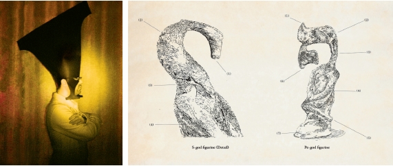
‘The Typographic Religion’ 프로젝트에서 Oded Ezer는 미래의 타이포그래피 신흥종교의 창시자인 샤먼(Typo Shaman)이 되어 의식을 치르고, 인류학자(typo-anthropologist)가 되어 신화를 연구하기도 한다. 세부 프로젝트인 ‘Typo Mythology: How type and mankind were created’는 문자와 인류의기원에 관한 신화를 다루는 픽션 프로젝트이다.
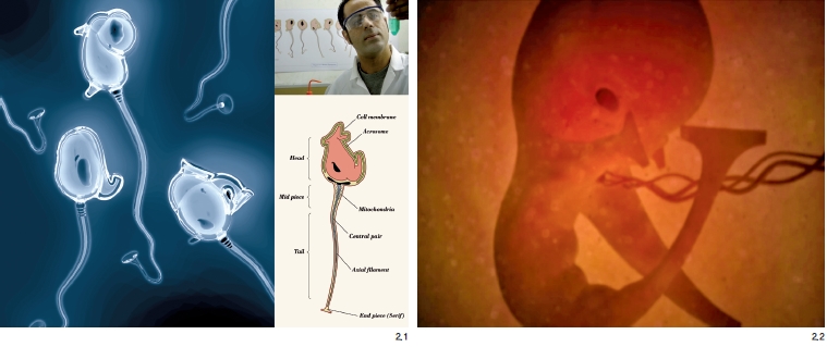
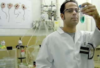
2. Biotypography
‘Biotypography’는 생물학에 근거한 타이포그래피를 뜻하는 Oded Ezer의 용어이다. 생명공학의 정의에 의거해, ‘Biotypography’는 생물학적 시스템과 살아있는 유기체 등의 개념을 이용해 ‘타이포그래피적’인 현상을 창조해내거나 수정하는 ‘타이포그래피적’인 응용을 일컫는다. Oded Ezer는 이 프로젝트에서 생명공학의 방식으로 생명체를 만들어낼 수 있는 타이포그래피 과학자로 분했다.
2.1. Typosperma
‘Biotypography’ 시리즈의 두 번째 프로젝트인 Typosperma에서 Oded Ezer는 절반은 인간의 정자이고 절반은 문자인 유전자변형생물체를 창조했다. 이 상상의 생명체는 복제된 정자의 DNA 속에 타이포그래피 정보를 주입해서 만들어낸 것.
2.2. Typembrya
세 번째 프로젝트 역시 현재의 생명공학기술에 영감을 받은 작업으로, 이 영상은 앰퍼샌드(&)의 타이포그래피적인 변이를 보여준다. Typembrya는 태아라는 뜻의 ‘embry-’와 ‘typo-’와의 합성어로 보인다.
이스라엘 타이포그래피계의 특징이라고 할 만한 것이 있을까, 그리고 모국어인 히브리어로 디자인함에 있어서 매력이나 어려움은 무엇인지
일반적으로 이스라엘 대부분의 상업적인 타이포그래피는 내게 지루하다. 그러나 그건 세계의 다른 나라들도 별반 다르지 않다. 히브리어의 매력은 당연히 언어 자체의 아름다움에 있다. 어려움은 영어와는 달리 세상 대부분의 사람들이 그 언어를 읽지 못한다는 것이다.
Is there characteristic aspect in Israeli typographic world? And what is the attraction or difficulty in designing with Hebrew, your own language?
I generally find most commercial typography in my country boring. But this is no different from any other country in the world. The attraction is obviously the beauty of this language; the difficulty is that, unlike English, most people in the world cannot read it.
문화적 배경이 당신의 타이포그래피 작업에 어떤 영향을 미치는가
매우 많이, 가끔은 너무 많이, 어떤 때는 전혀 영향을 미치지 않는다. 나는 타이포그래피가 강력한 도구라고 생각한다. 문자는 우리 사회를 형성하고 메시지를 전달하고 센세이션을 일으키는 거대한 힘을 지녔다고 믿는다. 이스라엘 태생으로서 나의 타이포그래피 문화는 주로 전통적이고 현대적인 히브리어 문자 시스템을 기반으로 한다. 물론 모국의 문화적, 국가적, 정치적인 환경에 영향을 받기도 했다. 이스라엘과 다른 나라에 존재하는 타이포그래피 디자인의 경계를 찾아내고 이의를 제기하며 대안을 제안하는 것이 나의 의무라고 생각한다.
How cultural background affects your typographic works?
Very much. Sometime too much. Sometimes not at all. I find typography a powerful tool. I do believe that letters have enormous power in shaping our society and delivering messages and sensations. As an Israeli born, my typo culture is mainly based on traditional and contemporary Hebrew type systems. I am, of course, influenced by the cultural, national and political environment of my country. I see myself obligated to find out and question the borders of typographic design as they are in Israel and in other countries and to suggest alternative solutions.
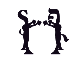
1. Tipografya, 2004
중국에서의 포스터 전시회를 위해 디자인했던 작업으로, 이후 Oded Ezer의 개인 로고로 사용되고 있다.

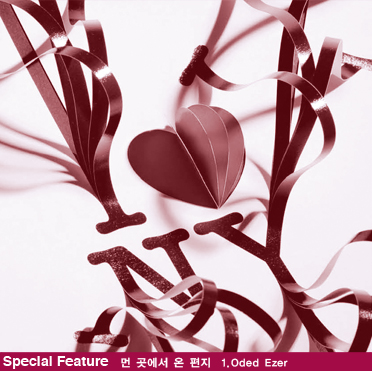
2. I ♥ Milton, 2009
밀튼 글레이저(Milton Glaser)의 ‘I ♥ NY’ 로고에 바치는 오마주(hommage) 포스터
3. Ketubah, 2009
케투바(Ketubah)는 유태인의 전통적인 혼인 계약서 양식으로, 유대 예술에서 널리 사용되는
양식이기도 하다.
타이포그래피의 아름다움은 어디에 있는가
문자는 내용이자 그것을 담고 있는 대상 자체이기도 하다. 문자는 ‘그것’일까, ‘그것의 상징’일까, 아니면 둘 다 일까? 이러한 부분과 관련하여, 내가 털이 많은 원을 만들면 그것은 하나의 털이 많은 원이다. 그런데 내가 만약 ‘원’이라는 단어 자체를 털이 많은 방식으로 쓴다면, 그때부터는 해석이 필요한 온전히 새로운 분야가 열린다. 이것이 내가 타이포그래피에 관해 좋아하는 것이며 타이포그래퍼가 된 이유이다. 나는 문자를 미워하기도, 사랑하기도, 배신하기도 하며 충성을 다하기도 한다. 문자는 내게 장난감 가게와도 같다. 문자는 나에게 있어 마치 비밀 같은 것이다. A가 왜 A처럼 보이고 Z가 Z처럼 보이는지는 신비로운 문제이다. 내 목표는 전에 없던 방식으로, 문자로 할 수 있는 어떤 새로운 걸 생각해내는 것이다. 타이포그래퍼에 대해 정의를 내리는 것은 시대에 뒤떨어진 일이다. 나는 나 자신을 과학자나 예술가가 아닌, 단지 장벽을 허물고 싶어하는 타이포그래퍼라고 생각한다.
What is the beauty of typography to you?
A letter is both the content and the object that carries it. Is it a “thing” or a “symbol of a thing”? Or both? I relate to these places because for me, when I make a hairy circle, it is a hairy circle. But if I write the word “circle” in a hairy way, it opens up a whole new field for interpretation. And this is what I like about typography. This is why I’m a typographer. I love hating the letters, love them, betray them or be loyal to them. It’s a toy store. Letters look like secrets to me. Why A looks like A and Z looks like Z is something mysterious. My goal is to figure out what can be done with letters that has never been done before. The definition of a typographer is outdated. I don’t see myself as a scientist or an artist, just as a typographer who wants to break barriers.
디자인을 공부하는 한국의 학생들에게 메시지를 남긴다면
좋은 타이포그래피는 완벽한 방식으로 메시지를 전달하지만, 탁월한 타이포그래피는 메시지 그 자체가 된다.
Could you leave a message for Korean students in design field?
Good typography delivers the message in a perfect way. Extraordinary typography is the message itself.
1. 『New American Haggadah』, 2010-2011
『New American Haggadah』는 하가다의 개정 번역본으로, 조나단 사프란 포어(Jonathan Safran Foer)가 편집하고 나단 잉글랜더(Nathan Englander)가 번역했다. 하가다는 탈무드(Talmud)에서 율법 외의 설화 부분을 말하며 유대교에서 사용하는 전례서이기도 하다.
2. Rutz, 2011
라틴어 서체 Vesper에 매칭되는 히브리어 서체이다. ‘running text’라는 표현에서 쓰일 때처럼, ‘Rutz’는 히브리어로 ‘running’이라는 뜻을 가진다. 5가지(Light, Regular, Medium, Bold, Heavy) 웨이트로 구성된 타입패밀리로, 5가지 웨이트로 된 히브리어 세리프체는 Rutz가 최초이다.
......................................................................................................................................................
이어지는 기사는 <지콜론> 10월호에서 보실 수 있습니다.
review
게시물이 없습니다
Q & A
게시물이 없습니다


